Kelly Schalow


First Republic Bank

First Republic is a private bank tailored to high net worth individuals.

First Republic Bank’s web application

First Republic Bank’s web application

I worked within a small team of designers to update the online banking applications. Shortly after I joined First Republic a new vendor was selected for online banking. We began looking at new designs for the applications through sessions with stakeholders. We then iterated on the ideas through testing prototypes with clients.

I was responsible for the design of authentication and enrollment. I was also responsible for building low-fidelity prototypes of the application as a whole. Once we had our initial designs completed I began creating a set of Sketch libraries for the team to use.

Post launch I was responsible for working with our vendors on iterative updates.


Digital Account Application

The Challenge

Allow clients and prospects to request new accounts online. Until this project, First Republic did not have a way to request a deposit account online. One of the main goals of the project was to have clients complete the application within 5 minutes.

DAA_hero.png

My Role

I worked with the design director, project managers, and developers to build the application. I created prototypes and the user studies to check them against. I also built out the component and content documentation.

Process

For the first version of account application we began with requirement gathering and ideation of approach. We then sketched out ideas which became prototypes. After a few rounds of refinement we documented everything for development. This process is being followed for each update to the application.

Discovery

Know-Your-Client (KYC)

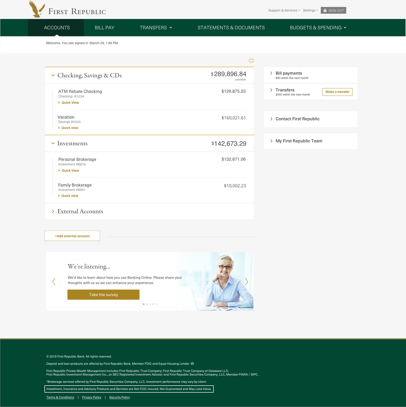
The known largest hurdle in applying for an account is the data gathering to prove identity. First Republic's version of this is a bit intimidating - the form itself is usually filled in by the banker because of the complexity. We needed to work with the team in charge of that form to make it as easy as possible to gather the needed information. We broke down the form and created a prototype to capture the same information. The design director created a few user studies and used the data to help the bank team with form revisions. In the application the form is much simpler and now divided in a meaningful way but is still the most complex part of the application.

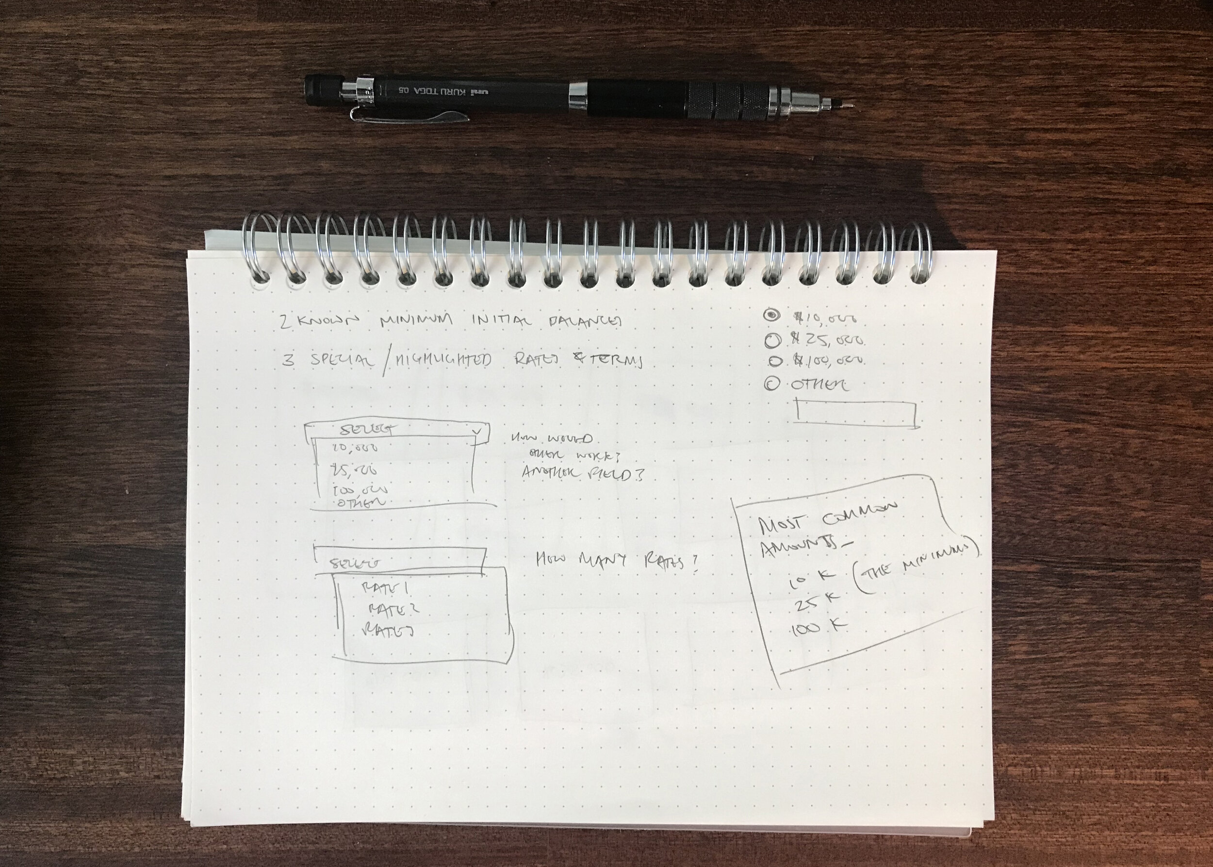
Certificate of Deposit (CD) selector

The Certificate of Deposit selector tool's design developed out of three principles. I go into more depth on this in the CD selector section below.

Length of application

The team's initial goal was to have users complete the application in 5 minutes or less. Initial testing of our prototypes showed that this was achievable with the design. As the application is expanding we've seen that it has stayed within 5 minutes in production.

Funding

Setting up a funding method for a new account made use of an existing tool from a vendor. I worked with the product manager and architect to understand what we could do with it. The design is based on shopping experiences. Several parts of the funding ideas are being tested.

Funding prototype - using an existing account

Funding prototype - using an existing account

Funding prototype - using an external bank account

Funding prototype - using an external bank account

Funding prototype - adding a new external bank

Funding prototype - adding a new external bank

Result

A prototype built on bootstrap was a starting guideline for our development team. We built out a component library in Zeplin including page templates for key items. A word document containing all content and HTML email templates were created.

1 month after initial release: ~$6 million in deposits (from an outside source) with over 200 applications submitted.


Prototype of flow for existing user

A portion of the Zeplin for this project

A portion of the Zeplin for this project

Certificate of Deposit (CD) Selector

The Challenge

Certificate of Deposit accounts have adjustable rates that a user can select. The CD selector needed to be easy to understand, clear about feedback, and quick to use.

My Role

I worked with the design director to prototype and test several version of the CD selector. I created prototypes and the user studies to check them against. I also built out the component and content documentation.

Process

I worked on initial concept ideation through prototyping. We created user tests to compare different ideas.

Discovery

The Certificate of Deposit selector tool's design developed out of three principles. First: The minimum opening balance is $10,000 (or $25,000 for a specific rate). Second: The bank may offer up to three special rates at any one time. Third: All rates and their respective term must be selectable. We used existing client data to understand current CD account. From these we created a few designs emphasizing the most used amounts and rates. A requirement to allow the rates to be updated by the bank at anytime was added. We tested three designs of the CD selector for large and mobile displays to get to what is available today.

Initial sketches of how to handle the CD selector

Initial sketches of how to handle the CD selector

Final design handed over to development

Final design handed over to development

Initial sketch for version CD selector that was implemented

Initial sketch for version CD selector that was implemented

Mobile example handed to development

Mobile example handed to development

Result

Full documentation of interactions, content, and visual design were created for development.

In-app Messaging

The challenge

The constant addition of new features meant that some updates were being missed by users. Targeted banners were being read as advertisements and ignored. The product needed a way to callout specific things to certain people.

My Role

I worked with the the mobile application vendor to create a way to display specific messages to users.

Process

We worked through a short Google Design sprint. I worked with the other designers to brainstorm, sketch and prototype. I was in charge or running the user feedback testing to help decide on the appropriate solution.

Dot voting on ideas

Dot voting on ideas

More ideas with dot votes

More ideas with dot votes

Discovery

Features that users asked for were being added but some were not noticed. The app used banners to display information that were ignored or complained about because of their placement. Banners could not be displayed in some areas of the app as they would be too out of place. We explored a lot of potential solutions with consideration for navigation and different functions in the app.

callout_example.png

Result

Documentation of several potential approaches to messaging within the application. What was developed were callouts that could appear on different items to describe or provide guidance.