
Intuit: Design for Delight
Overview

Defining our target audience
Design for Delight (D4D) is an idea; it is a movement to integrate design thinking into the workflow of every employee at Intuit. D4D is advocated through the entire company, the basics are taught to new hires, and employees are trained in D4D practices and ideas. Within Intuit there are currently about 125 D4D professionals, known as Innovation Catalysts. Design for Delight needed a central site to provide information to employees interested in learning more about D4D and finding more ways to integrate it into their workflow. Our task was to design the D4D website around certain tasks and information.
The primary tasks of the site, by order of importance, are to:
Provide information about the Design for Delight methods
Provide contact information of the Innovation Catalysts.
Provide a link to the customer-recruiting tool.
Problem Space
Our project started with the goal of designing and testing a platform for two separate sites that advocate the use of design thinking in the everyday work flow of all employees. One site, Design for Delight, promotes best practices of design; the other, Experience Design (XD), promotes best practices in research.

The Experience Design (XD) Site when we joined the company

The prototyped concept of Design for Delignt when we joined the company
Creating our problem statement to better understand our target audience
Research & Ideation
To get this off the ground we went through the information that is available on the current sites; we also conversed with the stakeholders and some individuals responsible for or closely related to the information of the sites. We also inquired about the main goal of the site and wanted to find out more about our target audience. We created the information architecture for both sites, comprising all of the items one the site, as well as any other items that might be added. We categorized these items and noted the similarities and differences between the sites.
Sketching & Wireframes
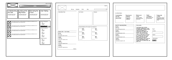
Some of our early and discarded wireframes
We began sketching different designs, of landing pages that could accommodate the different users and goals, of lower level pages that could hold all of the information on the site, and of filtering systems to sort through the information. We also created several wireframes based on these sketches, to test with potential users for initial feedback.

Some of the iPad screens that were explored
Mobile (iPad) Ideation
In the ideation process, I also used an iPad template to instill a mobile mind set, limiting the site to its primary task of method selection.
Visual Design
For several weeks we had been all working on similar tasks, mostly wire framing and prototyping. We had now been given ownership of different aspects of the project; I was now in charge of the visual designs. I began by talking with some visual designers and starting on ideas for mood boards. The mood boards began with a list of ideas that our project site held. These ideas were: approachable, teaching, learning, growing, natural, stories, fun. Based on these ideas I created several mood boards: hand-drawn, comics, organic, scientific, and construction. The mood boards were reviewed and revised several times.

The moodboards created for Design for Delight
The "Hand Drawn" Style

Initial, rough concepts of "Hand Drawn" visual ideas
Once the mood boards were completed, we made a decision to go forward with the hand-drawn mood. After having the mood boards reviewed, we decided to pursue the hand-drawn concept. Based on this I created several concepts for the site that built on the idea of something that is hand-drawn. I explored the idea of a piece of plain paper on a desk, a large piece of butcher paper on a wall, a large piece of sketching paper, tall whiteboard, and a whiteboard mounted to a wall.
Visual Iterations
It was decided that we would be pursuing the whiteboard on a wall visuals. Following this, I created four variations of the header area, three variations of the title area, two variations of the main content area, and four variations of the footer area. After getting feedback on all of the areas, the designs were edited and put together.

Iteration on the components of a page

Final Designs
Collaboration with Developers
These final mock-ups were then delivered to the developer, along with all of the assets needed. I sat with the developer to make sure that the site was being built as we wanted, throughout the process I edited several assets as needed to make sure the site would look as designed. Other edits came up through development, errors in content were adjusted and some visuals were edited or switched. Finally, we had all of the assets created and we set up a database to compile our work for future reference.